
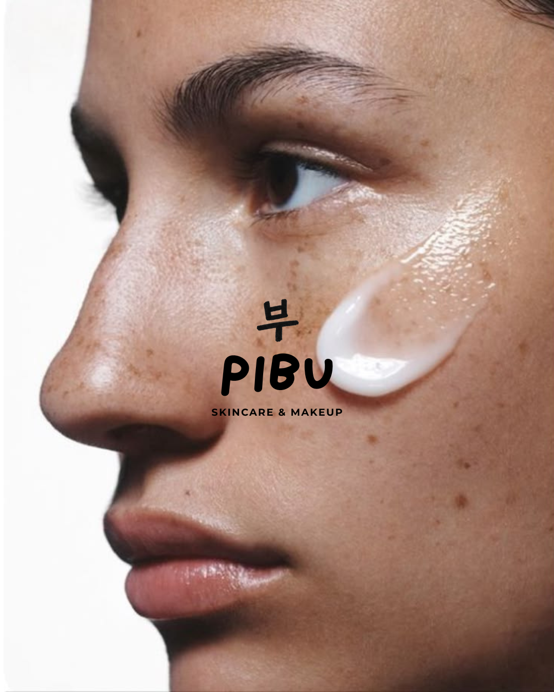
PIBU was designed around a simple idea: skincare should be approachable, inclusive, and visually engaging.
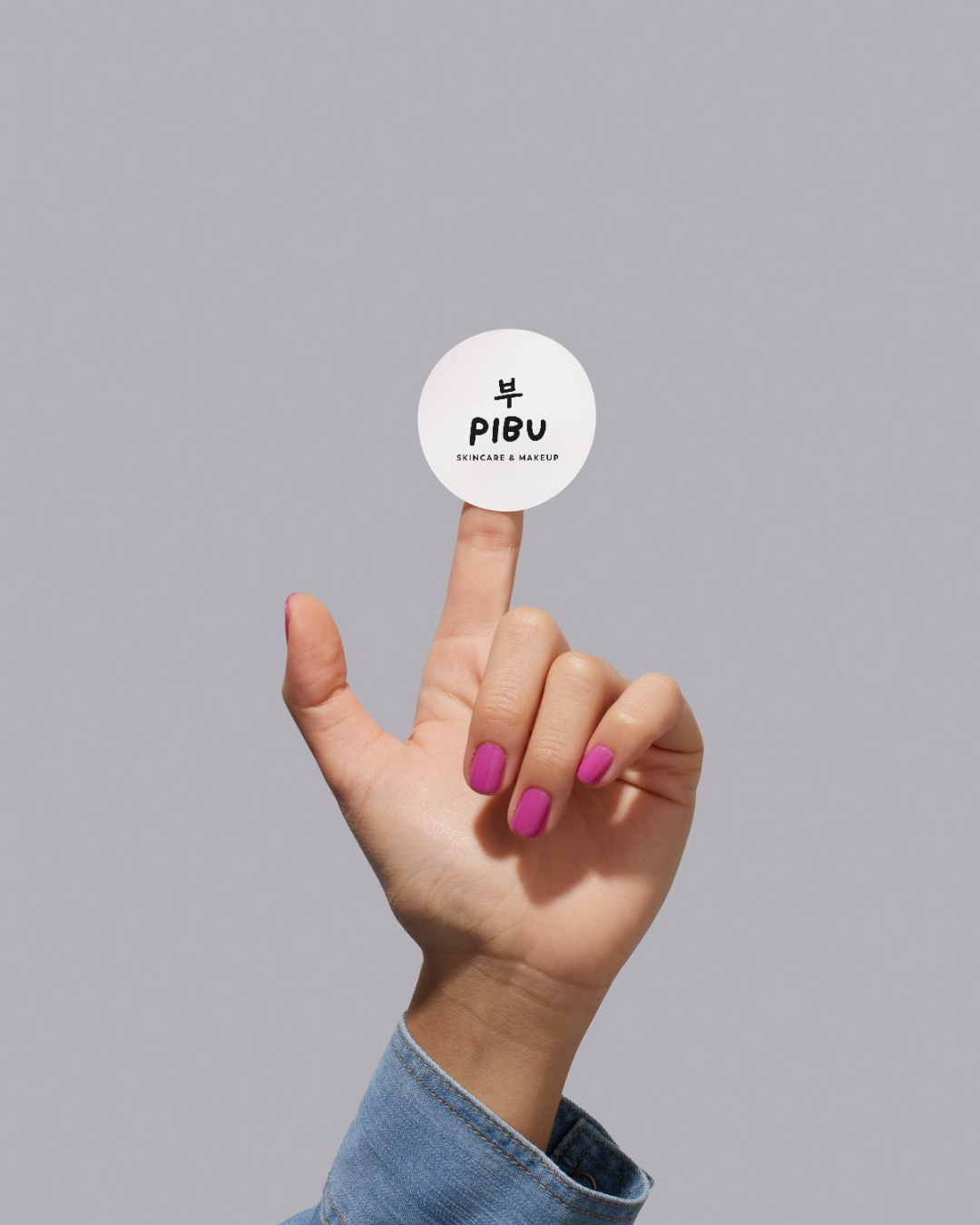
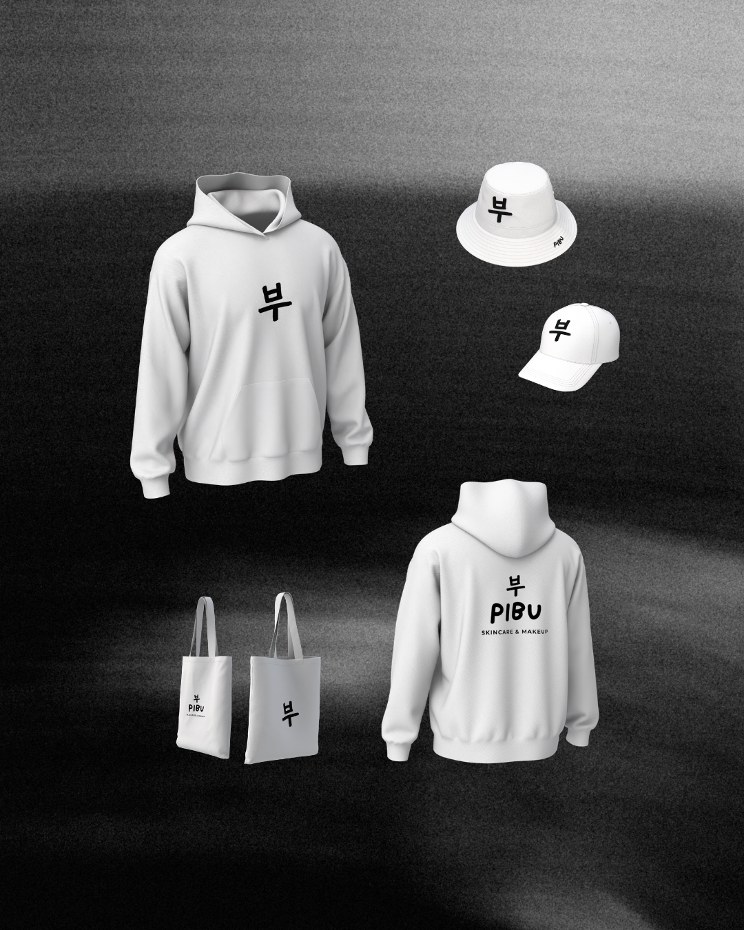
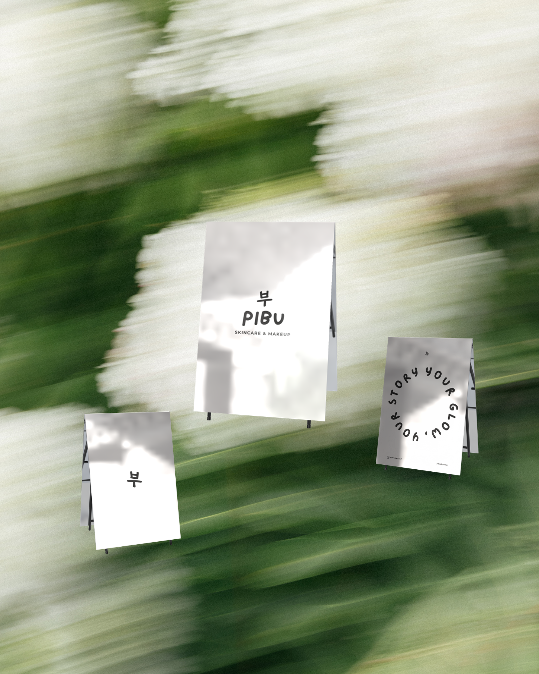
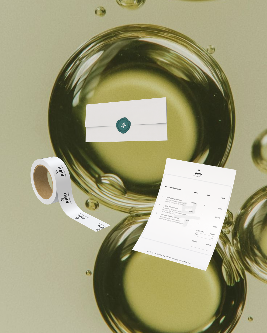
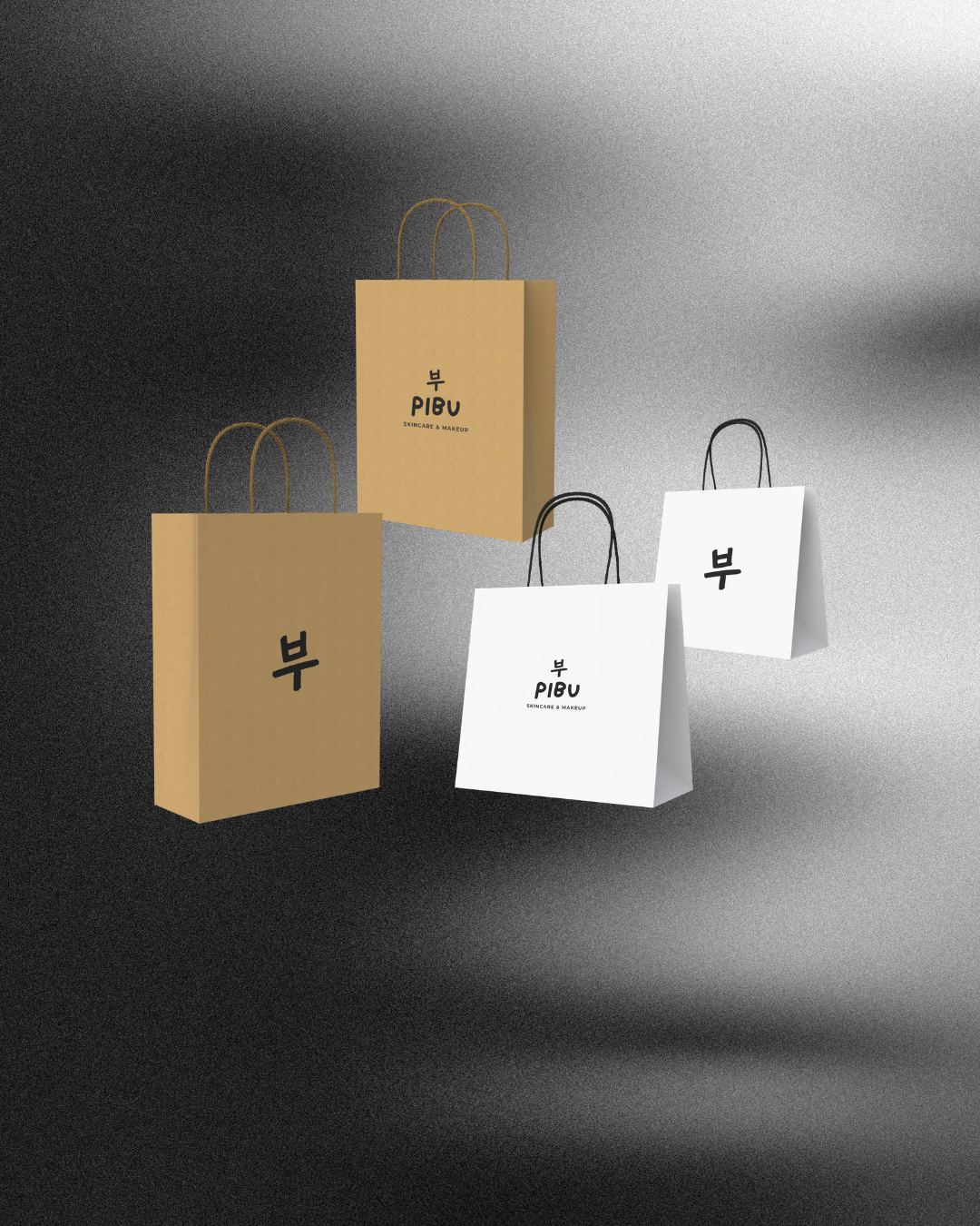
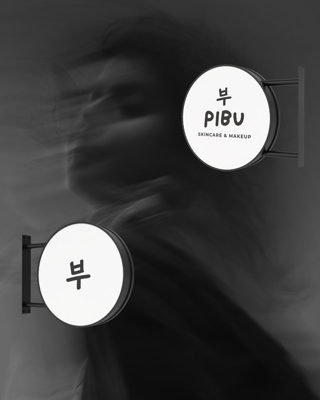
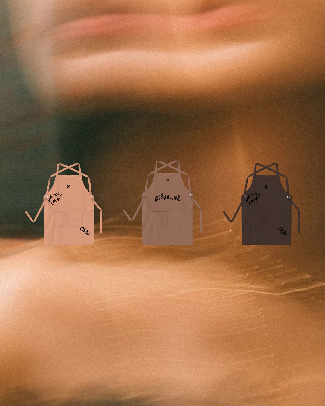
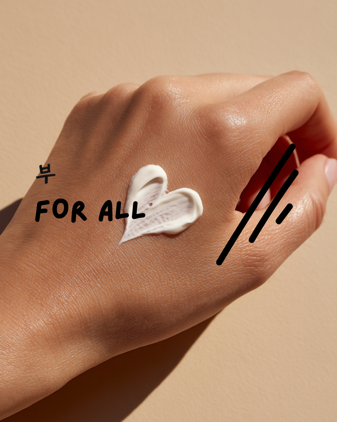
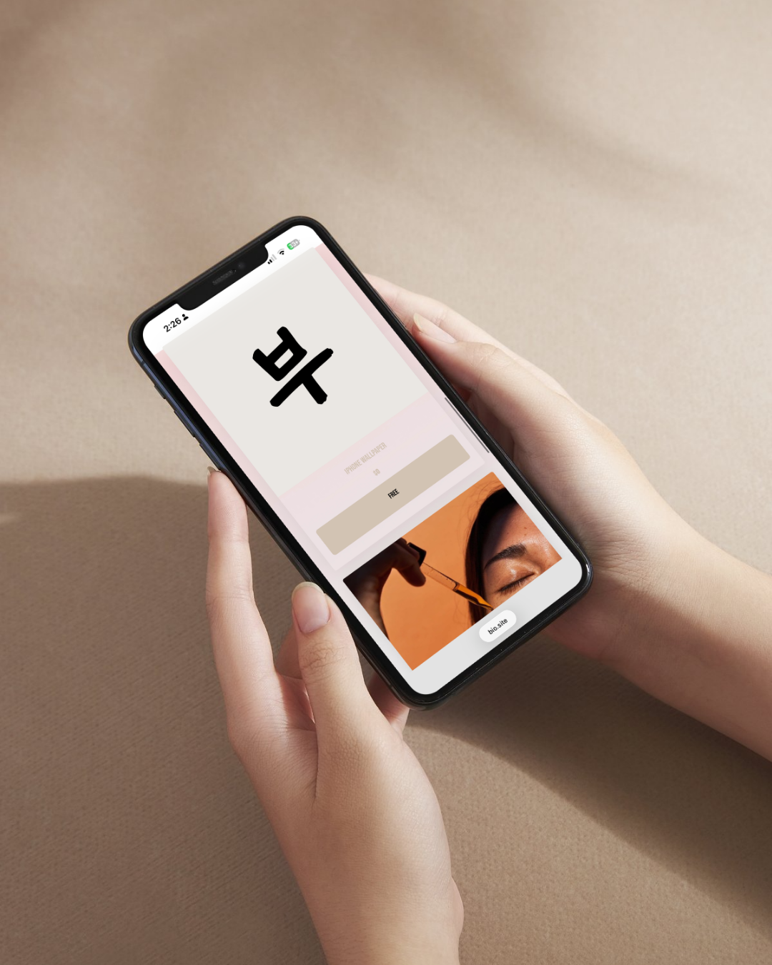
Inspired by the Korean word for skin, the brand identity combines playful minimalist with a flexible visual system applied across retail graphics, uniforms, stickers, tote bags, social media content, and a custom built microsite.
Every touchpoint was carefully designed to create a cohesive experience that feels fresh, contemporary, and unmistakably PIBU.
selective collaborations
For brands, spaces and stories with intention.